Recently, I was privileged to accompany Rick and Susan Sammon on a wonderful photo workshop in Iceland. At the end of the trip all of the workshop participants were invited to pick six of their favorite shots from the trip and do a little show & tell. Rick and Susan feel that this group slide show is one of the most educational aspects of all their workshops.
I didn’t just want to submit shots of the typical waterfalls and such. But what would I show? And why? Then it hit me. About four years ago I published a photo book on Malibu, CA, and several bookstores plus a gallery asked me to do talks about the book and the photos in it. That’s when I first was forced to take an outside look at my photography, and decide what made it tick. Were there any common threads that ran through my work? Any stylistic hallmarks – both intentional and unintentional – that I used over and over? It was a cathartic self-examination and has probably influenced my work ever since. So that’s how I chose what shots I would show. Six stylistic hallmarks and one shot to represent each.
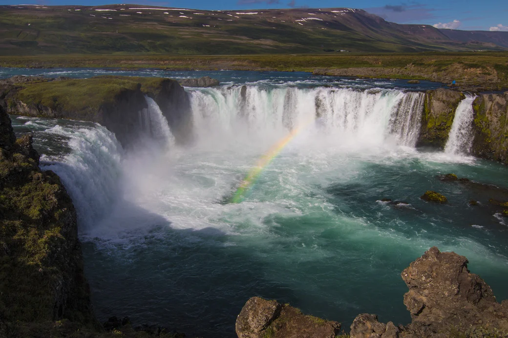
1. The name of my photo business is “It’s a beautiful world.” I love to show the beauty of our great planet instead of the focusing on the problems that sometimes beset us. That’s my focus. The photograph that opens this post was not an easy one to choose, though, because Iceland is filled with beauty in every direction. The one I chose was Godafoss waterfall on a sunny, warm day with a brilliant rainbow. It was a location I toured on my own before the group arrived.
2. The Moment of Convergence. When I’m out shooting, all of my senses are on high alert. I’m not only looking at what’s happening, but for what is about to happen. Are two animals about to interact in an interesting way? Are two elements about to cross paths to make a perfect composition? This alertness has resulted in many shots I would have otherwise missed. The two arctic terns that are jousting in the sky is a perfect example. I saw what was about to happen, and I was ready to push the shutter when it did.
3. Dramatic simplicity. I’ve long been a fan of the “Less is more” school of photography. The fewer elements in the frame, the more emphasis each gets. On the other hand, the more there is to look at, the less we see. I often remind myself, “Keep it simple, dummy.”
4. The Big 4. In this case the 4 is actually spelled FORE. I love a foreground element to guide us into the photograph. Often this goes along with leading lines, which I also often employ.
5. The dignity of man and animal. I rarely look down on my living subjects. Rather I meet them at eye level or look up at them, which, I believe heightens their dignity and the way I feel about them. I believe the horse, shot from a slightly low angle, looking right at the lens, with a soft background is a perfect example of this.
6. Tell a story. Often my photographs are more than the sum of the elements in the shot. They tell a story about the subject, the place, the conditions. They attempt to stir emotions. They encourage the viewer to read more into the story. My photo, “Alone,” talks about the immensity of nature, and the perhaps insignificance of man. The clouds of steam suggest an element of mystery and danger. The lack of other humans also suggests the strength of the individual, one man going it alone.
Rick, I appreciated you asking me to do this. And maybe it will encourage others of your readers to take a step back and take stock of their own photography. We all have stylistic traits that make our work “ours.” We just have to find them.


