Websites

7 Reasons To Switch to Squarespace 7

Does your site - your major presence on the web - need a make over? Do your images look as good as can be - on your web pages and in your on-line galleries? Is it easy and fun to update your site? Does your site look original and creative? If you have a technical problem, is customer support there to help - 24/7?

No? Look no further: check out Squarespace 7. A free trail is only one-click away.

(Speaking of clicking: Click on the images here to enlarge - another cool feature of  Squarespace.)

Here are my top 7 reasons why I use and recommend Squarespace 7. (Squarespace 7 will the default interface beginning on December 8, 2014.)

1) Live editing - you see what you get. In other words, as you create/edit, you see your results as the viewer see them. How cool is that!

2) You have quick and easy access to creative and customizable templates. Several new templates were added with the introduction of Squarespace 7.

3) Sites look great on any device – so your work is presented in the best possible way on desktops, laptops, iPads, iPhones, or any other device. You can even preview how a page will look on a device.

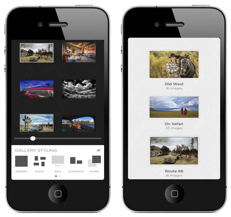
4) There's a free app – Portfolio - that lets you move your galleries from your desktop to your mobile device simply by downloading the app. You can customize you galleries, too!

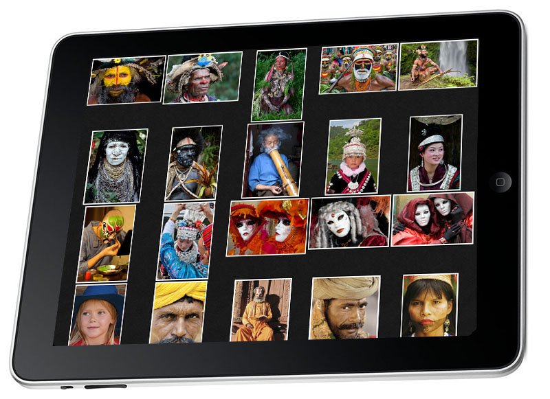
5) Galleries look awesome. A screen grab of my Memories of Myanmar gallery is shown above.

6) It's an all-in-one site – so your blog, galleries, events, store and so on are all in one easy-to-manage and updatable place. Checking stats is easy, too.

7) Customer support is 24/7 – so if you need help, it's away there.

Of course, there are more reasons to choose Squarespace. Those are just my top seven.

Explore the light,
Rick

 

Start Building an Awesome Web Site with Squarespace

rick sammon.jpg

As readers of my blog know, I switched my site to Squarespace about a year and a half ago - for a much cleaner looking, all-in-one, do-it-yourself web site.

You can read about why I made this switch in this post: 7 Reasons to Switch to Squarespace.

If you have some time, take advantage of a free trial and start building your own awesome web site. 

sammon squaerspace 1.jpg

One of the newer photographer-oriented features is a free iPhone and iPad app - which is an awesome way to share your images with others. You got the word "free," right?

for blog.jpg

Now, there is yet another reason to switch to Squarspace: $. Recently, Squarespace  announced the availability of a much-awaited Commerce platform. With over 20 new features, Squarespace Commerce lets you easily add store pages to their website and start selling products – both physical and digital – immediately. You can read more about this cool feature here.

email-commerce-hero.jpg

So what are you waiting for? 

Explore the light,
Rick


Got Web/Mobile Galleries? If Not, What Are You Waiting For?

rick sammon.jpg

Above: Images in my World Portrait gallery.

When I give a presentation on the business side of photography, I say to my students: "Your pictures do you absolutely no good sitting on your hard drive and backup hard drive (or hanging out in the cloud). You need to get your best work out there for others to see. Today, even though the methods for showing and sharing one's work has changed, the old adage - 'Publish or Perish' is still true."

In addition to getting your work "out there," galleries are a way to generate income. For me, I print the images in my galleries and sign each one. Most of the photographers I know, however, opt for on-line, automated sales. 

I tell my students that the best way, as well as the easiest way, I've found to share one's work is through the web-based and iPad/iPhone galleries offer by Squarespace.

Screen Shot 2013-07-11 at 10.01.11 PM.png

Above: My most recent Gallery - Camargue Horses.

If you click the Galleries on the left side of this page, you'll see a drop down menu of my galleries, which I am constantly changing and updating. For example, I added my Camargue gallery shortly after returning from a workshop that I was leading in Provence, France. Adding that gallery, by the way, took about 20 minutes, thanks, in part, to the drag-and-drop feature of adding pictures in Squarespace galleries. Converting my RAW files to JPEGs with Photoshop's Image Processor was also time-saver.

rick sammon a.jpg

Above: Squrespace Portfolio app on my iPhone. Full-frame view is also an option.

Speaking of included features and ease of posting, Squarespace offers a free mobile app - for both the iPad and iPhone - called Portfolio. With this awesome app, your website galleries are automatically linked to your mobile device, so you can share your pictures while on the road.

rick sammon b.jpg

Above: Thumbnail view of my Route 66 Gallery on my iPad. 

I gladly, happily and eagerly share my images. Sometimes for fun. Sometimes for business. I always encourage the sharing aspect of galleries.

I meet some photographers throughout the year, however, who don't have on-line galleries. Some don't want to share their work, for fear of someone stealing their images. Others think it's too difficult to create galleries. Still, some photographers don't think they need galleries.

rick sammon c.jpg

Above: Images look awesome full screen on the new iPad.

I'm interested in your take on on-line and mobile galleries. Do you have galleries? If so, why - and how are they helping your business, or helping you to simply have more fun with your photography. Likewise, if you don't have galleries, why not?

Please leave your comment in the Comments section here so other can read and learn.

Explore the light,
Rick

What Does Your Web Site Say About You?

sammon web .jpg

I know I might sound like your mother, but . . . "First impressions are important."

It's true, and in today's world of social media and mobile devices, it's especially important to make a good first impression - especially with your web site. If you don't make a good first impression, folks may click off your site in a matter of seconds, or less.

Your web is your home on the web, and in effect, when you set up a web site, you are inviting people into your virtual home - your galleries, your blog, and your store. You are also inviting people, from around the world, to read about you . .  what you like and don't like, what gear you use, and where you have been and where you are going. You are also telling friends, followers – and total strangers – about your accomplishments and goals.

So indeed, your web site says a lot about you.

Left: Old, cluttered web site. Right, new, cleaner Squarespace web site.

Left: Old, cluttered web site. Right, new, cleaner Squarespace web site.

Above left: I used to have a cluttered web site, plastered, like many web sites, with ads on the right. It worked well, but it was just too busy and did not showcase the most important aspect of my work: my photography. I looked more like a photo store than a photographer.

Above right: Back in November, I switched to Squarespace because I wanted a clean web site on which I could showcase my photography. I chose Squarespace for several reasons: cool, totally customizable templates; all-in-one source for my blog, galleries, store, classes and more; ease of use; and 24/7 customer support. In addition, a Squarespace site looks great on desktops, laptops, iPhones and iPad - which is not the case with all web sites.

I still have ads, but they are placed at the bottoms of several posts a months, as well as on my sponsors page. I have found this placement to be much more effective than putting bright banner ads on the right. Studies have shown that regular readers become numb to these ads.

You can read more about Squarespace, and the awesome new Squarespace iPad and iPhone app, in this blog post.

Today, I think my site says: Rick Sammon loves photography - all aspects of it.

What does your site say about you? Leave a comment in the Comments here - along with a link to your site. Don't be shy. Show others your work. You may get some constructive criticism . . . and/or some great ideas. I'll take a look at each web site. Who knows? I might find some undiscovered talent, as I have done on my Tough Love portfolio reviews.

If you don't know what your web site says about you and your work, maybe it's time for a web site makeover.

If you are in the NYC area, I am giving a talk on social media and building a web site at Adorama on February 19th. Info here.

If you like stuff like this, you can subscribe to my blog here.

Explore the light,
Rick

This site powered by (designed and hosted on) Squarespace. Use one-click to get started with your own awesome Squarespace site.

Landing At Squarespace

bald eagel, rick sammon.jpeg

"It's been a long time comin'."  -  David Crosby

I finally have a web site that represents my photography and my photo philosophy. I chose a SQUARESPACE web site as my home on the web for my blog, galleries, workshops - and more - because it's the only self-publishing web site that I've found to be easy to manage and fun to use. Customer support and all the creative options for photographers are yet another reason why I landed here.

Explore my Galleries. Check out my workshops and seminars.

Of course, please subscribe to my blog, which will be the home page for ricksammon.com. I will try to post useful info every day . . . when I am in the country.

Click here to subscribe to my blog. Thanks in advance for following along.

If you have an idea for a post, please shoot me an email.

And speaking of my blog, notice that the pictures look bigger and better. That's quite nice!

If you are looking for an awesome place to host your website, check out SQUARESPACE.

Explore the light,
Rick Sammon